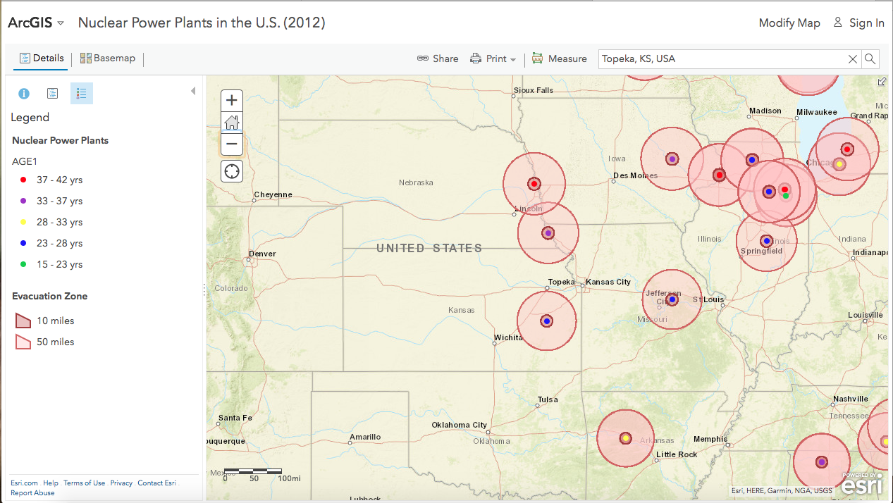
Look at this nuclear proximity interactive map by Esri, an expert in spatial analytics. (See one of their many cool disaster response maps here. Or here.)
Scroll around to see the 65 active nuclear plants scattered across the U.S. surrounded by 10-mile (red) and 50-mile (yellow) radiuses, or plug in your address to get the exact distance you are from the nearest few plants. Then you can prep for the news that there’s been a leak or an explosion.
You can also turn on layers on this map that show the locations of historic earthquakes and fault lines.
Esri specializes in GIS. This stands for geographic information system and it’s a framework for gathering, managing, and analyzing data. Rooted in the science of geography, GIS integrates many types of data. It analyzes spatial location and organizes layers of information into visualizations using maps and 3D scenes.
With this unique capability, GIS reveals deeper insights into data, such as patterns, relationships, and situations—helping users make smarter decisions. There is an increasing need for towns and cities to handle their CCTV feeds, traffic flows, drug abuse, restaurant use, et.
GIS even helps to gain insight into data that might be missed in a spreadsheet. For instance, a map can measure job growth or losses in different industries and quantifies local competitive advantage.
And Esri: https://www.arcgis.com/home/webmap/viewer.html?webmap=90c6e8972f094eb380f13d4f68ffa7e4

